Well, we’ve dodged a bullet. Or so it seems. Equities, you may have noticed, have clawed their way up from their recent nadir. Not all the way, mind you, but they’ve definitely rebounded.
The S&P 500 really stuck a lump of coal in investors’ holiday stockings when it tumbled 20.2 percent from its autumn high. If you’re familiar with the math of breakevens, you know it’ll take a 25.4 percent climb from its Christmas Eve crater to get the benchmark on a level to resume a bullish track. As of this writing, the S&P’s managed just a 10 percent scrabble from the bottom.
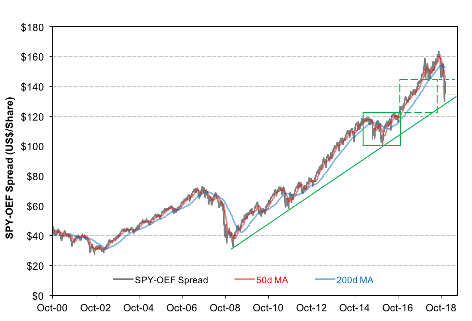
Investors keeping an eye on the SPY-OEF spread (see our recent “What, Me Worry?” column) have seen the uptrend support line hold and are, perhaps, breathing a little easier now.

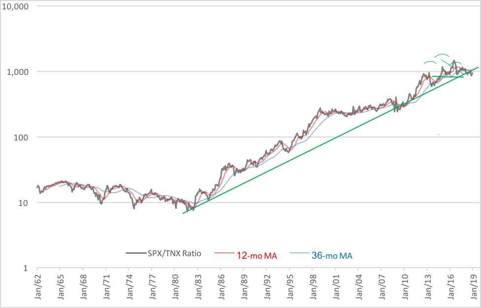
While there’s cause for some cork-popping, we’re not out of the woods. In fact, the thickets ahead may be darker still. There’s another chart, a longer-term graph, that maps out a worrisome pattern. It’s the ratio of the S&P 500 over the 10-year Treasury yield (TNX). The chart below plots the monthly trajectory of the ratio on a logarithmic scale. You can see the indicator’s been on an uptrend since 1982. Simply put, equities—despite the honking of various black swans and the swoons brought about by recessions—have been growing while T-note yields have been slipping. Put another way, there’s been a bull market in both stocks and notes for nearly 40 years, an ideal environment for a so-called “balanced,” or “60/40,” portfolio.

All that could change as evidenced by a topping pattern that’s been developing over the past four years. See the head-and-shoulders formation nudging the long-term uptrend line? A break through support could put eight years of recent upside work in jeopardy. And that’s just the near-term prospect.
Yields in the long term seem destined to rise on a secular basis, meaning notes and bonds are likely to become riskier and riskier. We’re seeing this change in perception manifested in the new-issue market already. There’s been a dramatic decline in demand for government paper at auction. The bid-to-cover ratio for more than $2.4 trillion in notes and bonds offered by the U.S. Treasury in 2018 was just 2.6, the lowest in any year since 2008. The ratio compares the dollar amount of bids to purchase versus the amount of paper on offer. The higher the ratio, the greater the demand.
That’s not to say that a doomsday for bonds looms today, but it is an early warning sign that demand may not keep up with a burgeoning supply of government obligations anticipated in the future. Auction sizes have been growing and Federal Reserve offtakes have been shrinking recently, so some softness in the bid-to-cover ratio might be expected. Still, history tells us that nearly all fiscal crises are preceded by persistent declines in the ratio. The tell-tale of real trouble will be the number and length of tails—spreads between the average and high bids—at upcoming auctions.
Sounds like a good time to build ladders with short-duration paper, doesn’t it?
Brad Zigler is WealthManagement's Alternative Investments Editor. Previously, he was the head of Marketing, Research and Education for the Pacific Exchange's (now NYSE Arca) option market and the iShares complex of exchange traded funds.


