
(Bloomberg View) -- Every three months, the U.S. Federal Reserve publishes a chart -- known as the "dot plot" -- showing where various officials think the central bank's interest-rate target should be over the next few years. And every three months, investors and the media consistently misinterpret it.
A couple changes could make this widely followed monetary-policy tool a lot more useful.
The dot plot has two big perception problems. The first is the belief that it reflects officials' interest-rate forecasts. It doesn't. Rather, it shows what each participant thinks the Fed should do, based on his or her individual forecast of how the economy will evolve and what the optimal response would be.
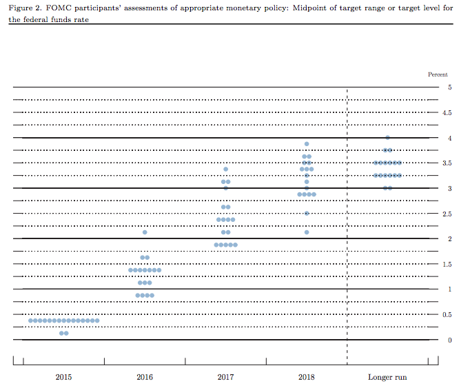
In other words, the dot plot offers a great representation of how much officials disagree. It says nothing about which of their views will prevail when the policy-making Federal Open Markets Committee forges a consensus. Will governor X’s perspectives prove persuasive during the remainder of 2016, and what about in 2017? This deliberative process is the essence of how the committee works, and the dot plot is completely silent about it.
The second issue is that investors tend to see the dot plot as a commitment about the trajectory of rates. As my Bloomberg View colleague Mark Gilbert explains, markets tend to view even a relatively small change in the dot plot -- like the one that happened last week -- as eroding the Fed's credibility. As a result, Fed officials may feel pressure to avoid making changes, a reluctance that places a constraint on their ability to pursue the central bank's legitimate goals of keeping inflation close to 2 percent and promoting maximum employment. (Frederic Mishkin and Amir Sufi make a similar point in a recent column.)
Change the Timing
What to do? For one, change the timing of the dot plot’s publication. Three weeks after every policy-making meeting, the Fed releases a set of minutes that offer valuable detail on the heterogeneity of perspectives expressed. As another way to communicate that difference of opinion, the dot plot would make a great supplement to the minutes.
Beyond that, the Fed should release a quarterly collective medium-term forecast for inflation and unemployment. By collective, I mean that officials would actually vote on the forecast, much as they do on the minutes and on their regular monetary-policy statement. The release should include easy-to-read charts depicting the margin of uncertainty around the forecast, along the lines of the Bank of England’s famous “fan charts."
Notice that I have not said that the Fed should provide a collective forecast for its short-term interest rate target. Policymakers' forecasts are inevitably seen as something akin to commitments. The Fed should be committed to delivering particular inflation and employment outcomes, not to a specific path for interest rates.
The current dot plot does far too much to promote confusion. With a couple tweaks, it could do a better job of providing clarity.
This column does not necessarily reflect the opinion of the editorial board or Bloomberg LP and its owners.
To contact the author of this story: Narayana Kocherlakota at [email protected] To contact the editor responsible for this story: Mark Whitehouse at [email protected]
For more columns from Bloomberg View, visit http://bloomberg.com/view.